Katy Wort

planning, production & presentation
 |
|---|
 |
 |
 |
 |
 |
 |
 |
 |
 |
|---|
 |
 |
 |
 |
 |
 |
 |
 |
 |
|---|
 |
 |
 |
 |
 |
 |
 |
 |
 |
 |
Lockdown 1
Lockdown 2
Lockdown 3
Branding lockdown


Using cut outs from magazines and images from Pinterest, I started to construct collage that I best believed best represented the aesthetics of each of the 3 Lockdowns. I began with creating Pinterest boards for each, considering both the memories and the feelings we had from being stuck at home throughout different stages of the pandemic. I settled on bright and colourful scheme for the first Lockdown, reminiscing the days we spend outside going fir walk and sunbathing in the garden. I'm interested in looking at the illustrations used on vintage sewing patterns, portraying the feeling of the first Lockdown feeling an age ago.
For Lockdown 2 I wanted to concentrate on using a bleak and more muted colour palette, representing the lack of optimism we all had when being shut indoors for the second time around.
Lockdown 3 for me is all about the structural elements of the roadmap and the new hope of the vaccine being put in place, hence the black and white scheme with pops of colour. I'm interested in using more organised patterns within my branding such as chevrons and stripes.
Format and Construction
Having initially been drawn to creating a magazine publication for my final outcome, I'm now interested in exploring different ways I can present my images. I'm still drawn to the concept of lockdown, procrastination and the imperfections of it all, however I want to explore further the ways in which we have experienced a journey and the roadmap that has been set out for our third Lockdown.


My Experimentation
Having started to look into different ways of presenting my work, I decided to have a quick experiment with creating something other than a conventual book or magazine. I created a very rough prototype of what it could look like, trying out different ways of involving pop out and fold out pages. I want to do further research into putting together a publication that visually represents a journey, both through content and construction.


Letterpress experimentation
29/03/21
This was my first time having a play around with letterpress, despite my prior admiration for traditional graphic design techniques. After my slight difficulties with getting the words to read the right way around, I soon figured out how to produce a print that you could actually read. It was only after doing all of my prints that I realised that I'd missed an 'e' out of the word 'useless'. Despite my minor failures, it gave me the chance to experiment with printing onto different paper using different weights of type.


Logo Rebrand
25/04/21
Having discovered a love for brand design throughout my Foundation course, I knew it was necessary to include some branding concepts within my FMP. Transport for London are an organisation who have an internationally recognised brand image and mirror the concept of procrastination and decision making being an example of a journey. I have taken some of the methods of procrastination mentioned on my Instagram poll and turned them into train/ tube station logos.

The well recognised London Underground logo

A 'Transport for London' inspired composition with the blue banner and circular shaping, created to symbolise our shopping as method of procrastination.

A TikTok and TFL combined logo design

A logo addressing how some people’s procrastination can still be productive, exercising being a prime example.
QR Codes

26/04/21
After my Interim Crit today, I've started to think about more ways in which I'm able to combine traditional Graphics with digital design in my work. With my project leaning in the direction of producing some sort of physical publication that you can feel and hold, QR codes seem to be a great way to introduce that interaction with the online world. Making moving image and sound a feature within my work creates an all encompassing sensory experience, subsequently being attractive to a broader audience. I have found a website that allows me to create my own codes that I able to link to webpages which could include expansions of my FMP theme.
My Inspiration


26/04/21
Having looked into the prospects of including QR codes within my work, I came across this edited video created by 'Geek Files'. I love the way a conventional photo album is expanded into moving images, videos and has the addition of sound. These pop ups help establish an atmosphere around the original photo. I'm excited to see how these addition of film and sound could create a more personable experience for someone interacting with my work.
Layout Experimentation
Procreate
29/04/21
Having already had a go at creating a less conventional leaflet, I want to look further into different compositions for my piece and what will work best with my content. Using Procreate, I constructed some nets for what my publication could look like when unfolded, considering what would best represent the concept of a journey.


London Planning and Preparation
The Procrastinators
29/04/21
I've looked into websites that generate free QR codes and I now want to put them to use. My plan is to produce a series of posters and leave them on tubes, buses, trains etc. Each of these posters will have a QR code that links to a separate site I've made: The procrastinators. On this site I have put together a questionnaire to help find out more about how people go about their daily lives. If all goes to plan I will be able to collect data from a wide range backgrounds and represent a broad scope of people.


02/05/21
In preparation for my visit to London, I printed out several posters and QR codes to leave in different locations. I soon realised that there was no point leaving them on the tube, my desired location, as no one would be able to use their mobile data to access the web. I reverted to sticking a few of the QR codes within areas that seemed appropriate. Overall it wasn't a huge success. I have had no responses to my questionnaire as I didn't have the confidence to stick my posters up everywhere.
A moment in time...


02/05/21
The day before our trip to London, I attempted to teach myself how to use my camera properly. I watched a YouTube video that taught me how to make the best use of manual settings, nothing I'd played around with before, and what shutter speed for example really means. This is something I'd really like to try using at a later stage but unfortunately didn't get put to use this time around. The nature of the photos I wanted to take were very much quick fire and in the moment, so spending forever changing my settings wouldn't have been ideal. I also ended up taking a lot of my photos on my phone as it was the quick and easy way to record anything I saw. The images below are all unedited and mainly there as a source of inspiration for my project.


Edits to Animations

Original image with the addition of tube map lines

Black and white version of the edit
Time-lapse of the photo edit
Stop motion animation made from individual images
07/05/21
The Transport for London branding is something I really want to get across in my project, the tube map being a key feature. I started playing around with simple lines and the look of them within an image. I settled on having them appear as if they're emerging from Benji's phone screen. The time-lapse feature on Procreate made me consider the possibilities of animation. I went back to the image I created and slowly erased one bit of each line at a time, saving each as an image as I went. From this I was able to produce the GIF style animation seen above. For me this video clip is the epitome of my final outcome: I want to produce an interactive publication that has endless possibilities, each QR code taking you on a separate journey and triggering you to subconsciously procrastinate.
Print Experimentation
11/05/21
Having really enjoyed my introduction to print in the earlier stage of the course, I thought it would only be right to introduce this back into my work. I want to focus more on the imperfections within my work and the interest that these so called 'mistakes' can add to any image. Here are some samples that I produced in the print room, paying around with mono print and stamps. I used a mixture of layouts, positive prints, negatives and ink opacities to add a visual interest to each piece.


Process Animation
Animations have become a great way throughout this project to create more content from just one idea. I love manipulating images to make them move and feel more interactive. I felt inspired by this approach to do something similar with my print making process, taking a photo each time a printed a new number over my Transport for London inspired logo. Unfortunately I didn't think to do this right from the start but I still like the way that this captured my working process and how the print evolved.
Edits


12/05/21
Using Affinity Photo, I had a play around with different ways to layer images digitally. I liked the idea that texture could change the whole feel of a visual: using a tin foil like overlay gave my prints a psychedelic more luxe feel in comparison to the authentic hand made look of the crumpled paper. My attraction to the more maximalist style made adding the tube map an obvious choice, creating much more visual interest within each piece.
Maps
Having hit a bit of a wall with the direction that i'd like my work to go in, I decided to look at some examples of unconventional maps and print publications that I have collected. I'm interested to see if there is any way these can help me come to terms with some variation of a 'final piece' for my project.


Inside Out: Amsterdam (charity shop find)


Old London bus maps (charity shop)
Current tube maps I picked up in London


Guide to AUB with fold out map
AUB promotional material
Letterpress
18/05/21
I've spent the last couple of days working solidly with letterpress prints that I can incorporate into my more digital designs. I love the unpredictable outcomes and the roughness around the edges in comparison to the precise nature of a a digital typeface. The main structure of my piece will revolve around a timeline of moments that have been significant over the past year, signposting them with headlines. I tried out a mixture of words and phrases that I associate with moving in and out of lockdown. To add more interest to these prints, I played around with a variety of different backgrounds, from using maps to blue kitchen roll to collaged pages.


Layering & Composition


This is an example of how my prints evolve when I begin to layer type. I began with a section of an old London map as my background with a white wash over it to dull down the colours. As I continued to experiment I became more confident with laying out type in more creative ways, hence the use circles. I though this would also well reflect the Transport for London logo that is seen throughout this project. I like this print in particular due to the irregularity of typeface and weight.
The Encounters project encouraged me to be more resourceful with my work, this being an attitude I want to bring forward with me. The lack of accessibility to resources throughout lockdown was very significant to the way we lived each day; using tissues instead of loo roll became a norm for many! I used techniques I had learnt during the last project to create my backgrounds, acrylic paint an nail polish remover becoming useful materials for these transfer techniques.
Acrylic paint with newspaper laid over the top. the newspaper is removed before the paint dries (left)
Newspaper is laid facedown onto a surface, canvas paper in this case, and soaked in nail polish remover. I use a spoon to help the ink take to the paper (right)


Yes another animation!

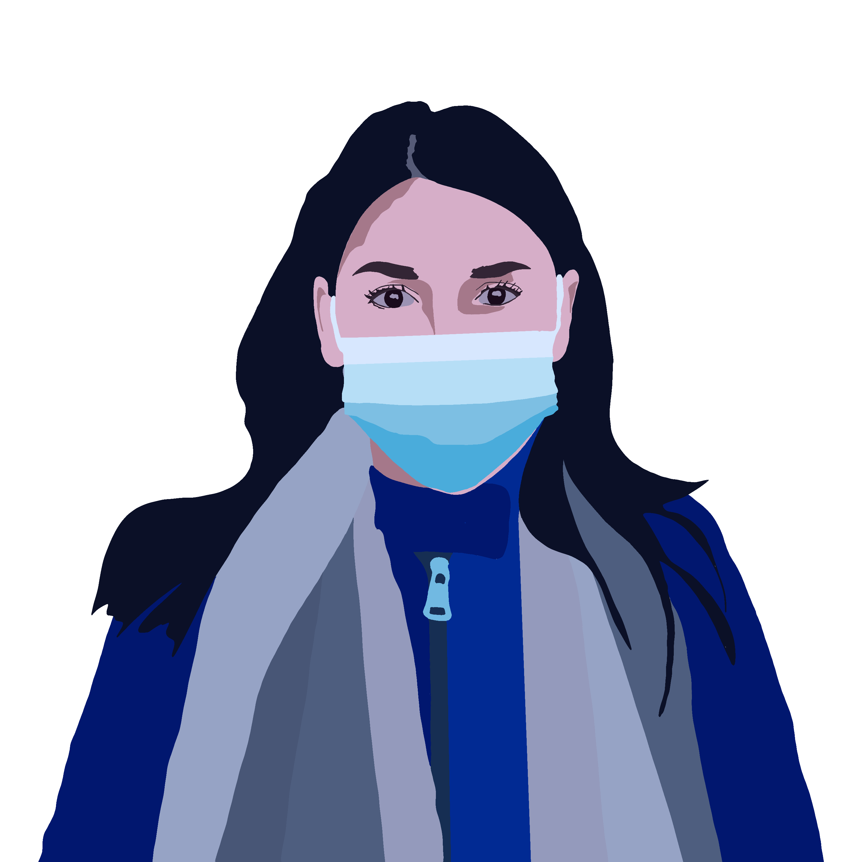
This was just another stop motion gif style animation I created, triggered by the fascination of the different styles and ways of wearing a facemask there are, having it sit under the nose being a popular one! Ideally I would love to evolve this into an interactive link via a QR code, functioning a bit like creating an avatar for a video game, facemasks becoming a 'customisable' feature. Unfortunately this animation didn't export with a very high resolution so this is something I perhaps need to look into for a higher quality result.
London Visit: Rediscovered Videos
23/05/21
When scrolling through my camera roll on my phone, I rediscovered a collection of video footage I took on my trip to London on the 2nd may. My fascination with creating an all encompassing experience with my project, including potentially sound and video triggered me to think about the busy environment of a tube station. unfortunately our visit took place on a Sunday so I was unable to capture the rush around of commuters which people associate with travelling on the London underground.
I tried to take a time lapse video of Liv standing in front of the tube as passengers were getting off however, due to to speeding up of the clip it only ends up being a couple of seconds long. it would have had much more impact if it had been taken on a weekday.
Mock-ups


23/05/21
I hit a bit of a wall (pardon the pun) with where to take my project next so had a look at the virtual exhibition David had put together to present all of our work. Seeing my prints up on a wall made me consider them as pieces of work in themselves, rather than things that I had to continue to manipulate and add on to.
I began to look through all of the prints and collages that I had already created for my project and position them in the setting of a tube station. I took stock images and used Procreate to position them over the top of existing posters, much like I did for the earlier Storytelling project. There was also the consideration of lighting: the image (top left) has obvious reflections of light from a tube within the station so this is a consideration I had to make when using my own Graphic image. I experimented with different brushes to produce this effect.
This simple exercise proved to me that simple fixes can often be just as effective. I was started to over complicate things with thinking about ways to combine all of my letterpress work, resulting a in a bit of a mess. This demonstrates the ease of going overboard and my tendency to try and push everything one step too far.
Hands, Face, Space


25/05/21
Having done a lot of experimentation on the print side of things, I wanted to introduce a bit of photography as after all my project is all about how the pandemic has impacted us as people. Masks have had a significant change to the way we go about our daily tasks. Since becoming compulsory to wear in many scenarios, I have seen a vast range of ways that people have interpreted the word 'face covering', hence the collection of images above. I took inspiration from the pop art style of composition as a way of showing these variations. So many posters that we now see around us are digital rather than large prints, giving me the opportunity to incorporate my animation skills. In the ideal world I would've been able to included a wider range of models for my images, varying in age, race and gender as this would then target a more diverse audience.
Virtual space: Art Steps
Inspiration


25/05/21- An American Werewolf in London
This iconic movie scene has inspired me to take the graphics posters I created and put them in situ. A very isolating environment is created the maze like construction of the tube station, with the lack of empty walls. You don't turn a corner without seeing a different poster. I want to recreate this feeling within a virtual space, drawing from the feeling of constantly being surrounded by rules, regulations and announcements throughout the pandemic.
Virtual Tube Station

Art Steps virtual space
I was very anti experimenting with Art Steps at first as I was convinced that my work wasn't very well suited to a gallery space. Once I'd got over my stubbornness and after conversations with David, I began to realise the possibilities of creating a space that imitated that of a tube station. I'm most excited about the use of my London videos of the tubes within my virtual space.
It is still very much in its infancy stages whilst I'm getting used to all of the tools but I feel it is a great way for me to be able to display all of the experiments I have been working on and potentially include some of my work from previous projects. My current challenge is to fill every wall up to create that isolating and almost claustrophobic space, much like in 'An American Werewolf in London'. I want this to mirror the feeling of being in a lockdown once again: feeling detached from human interaction yet bombarded with news headlines and restrictions.
All dressed up with nowhere to go...
Now that I'm set on constructing a virtual tube station to consolidate all of my work, I wanted to conduct one last photoshoot. Over the past year I have become obsessed with selling my clothes and second hand finds on online selling platforms like Depop to make a bit of extra money. People have become more conscious of their buying habits as after all we're not going to wear our clubbing outfits to sit on a sofa at home- or are we?? I wanted to produce a series of photos that encapsulated this new motto of 'All dressed up and nowhere to go'.
Georgia (27/05/21)- unedited photos
This was my first trial of my concept, using my friend Georgia as a model. I got her doing a variety of 'Lockdown' related things around the house and garden, reincorporating my theme of procrastination. I'm pretty pleased with how some of the photos have turned out however they fail to give off that fun and slightly witty look that I'd love to come across in more of my work. They feel a little to staged.


Mum and Dad (30/05/21)- unedited photos
I decided to try to take some more photos with the same concept at the center of it. I had way too much fun going through a box of my Grandma's old dresses that we found in the loft and choosing the right one for my mum to wear. There was more of an attempt with this shoot to make it more candid and natural- less posing!! For me these photos much better represent our more fancy clothes that have been pushed to the back of the wardrobe for the past year. Thinking abut it now it could have been fun to play around with the go to ' working from home' outfit with shirt and tie on top, pajamas on the bottom.


My Virtual Tube Station
31/05/21
...and my virtual space is complete!
Having experimented with putting some of my work up on the walls, it felt only right to fill every blank space and go full on maximalist (true Katy style)! My goal was to recreate a space somewhat similar 'An American werewolf in London' that encompassed that feeling of being trapped and quite claustrophobic, echoing many mutual feelings of lockdown. In the ideal world I would have been able to play around more with the dynamics of the space: curving the ceiling, adding graffiti to the walls and make it overall less uniformed. I would be interested to looking into different versions of virtual gallery builders and perhaps test out paid versions to see if they had more flexibility for creating a space. I do however still feel the space I created represents the overall aesthetic of a tube station with its style and composition.
Although my virtual space appears finished, I would still like to play around more with the composition of the posters. I began with the primary aim of just filling up every space on the wall but I would now like to go back and switch a few pieces around, mixing up prints with photos and animations and digital drawings. This is something I can experiment with working towards the exhibition date and make sure I'm happy with the pieces of work I have chosen to include. I later noticed the option to add an mp4 soundtrack to your exhibition, meaning I could produce more atmosphere within my space. I would again like to trial this for the exhibition to create a further impact on my audience. I'm excited about the potential for my virtual space and the endless opportunities is provides for me to experiment within my practice.
List of what I would add next time/if I had more time/if we were putting on an in person exhibition:
-
Add sound to my space- either an underground station soundtrack or the song 'Just for the Times' by Everyone You Know and Joy Anonymous
-
Experiment further with the composition of the space- maybe consider creating an order to the space through lockdown 1, 2 and 3?
-
Edit the photos from my 'All dressed up with nowhere to go' photoshoot
-
Conduct another photoshoot that features the go to Zoom call outfit (party on the top, PJ's on the bottom)
-
Create more conventional advertisements to add into the space and to make feel that bit more real
-
Find someone who owns a VR headset and play around with the different features on Art Steps
-
Make a mini model of the space, including stamp sized posters on the walls
-
Make the space feel more used and dirty- a more used floor, graffiti on the walls, train tickets lying around etc